Logo Development, Visual Identity System, Brand Guidelines
Date:
August 2025
Industry:
Real Estate & Infrastructure Development
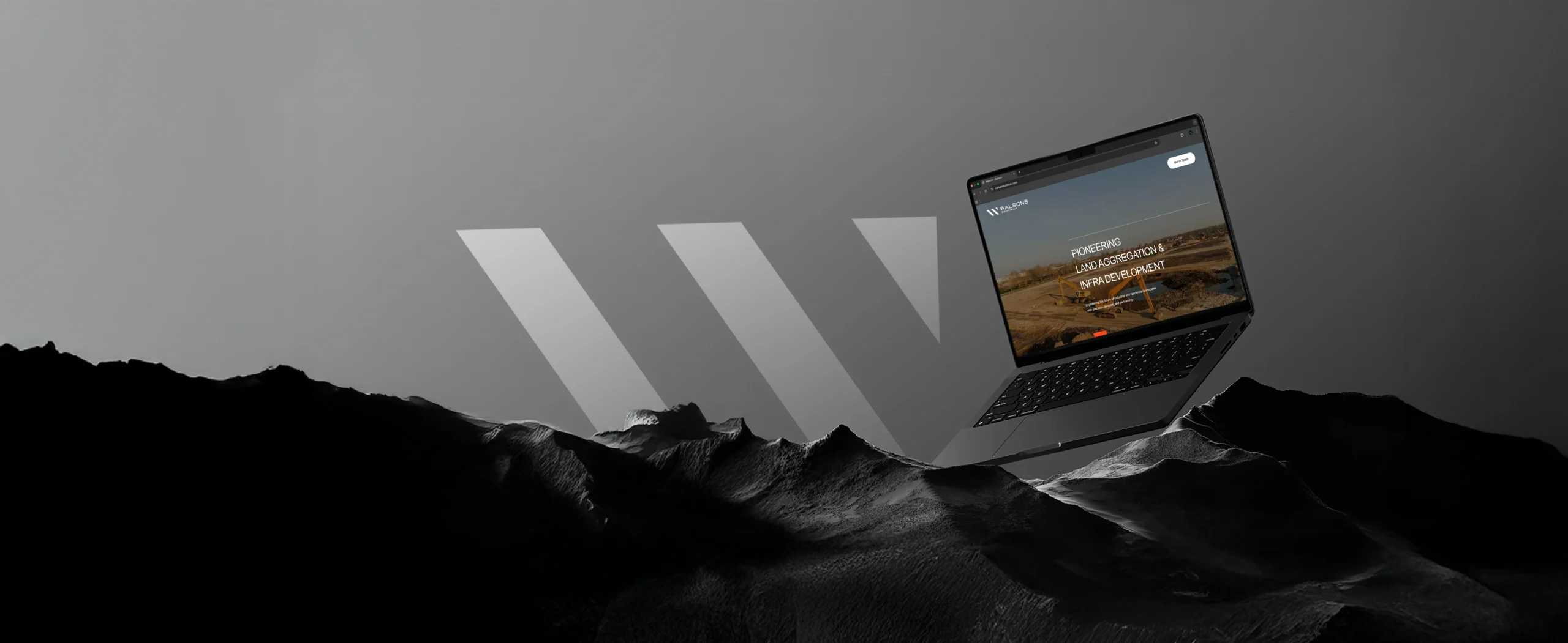
Far & Wide developed a bold, modern identity for Walsons, a real estate and infrastructure company translating their values of trust, strength, and growth into a timeless brandmark and visual system.
Challenge & solutions
Walsons emerged as a new brand identity unifying an aggregation of established companies with a strong legacy and proven track record in real estate and infrastructure. The challenge lay in creating a fresh identity that not only looked modern and distinctive, but also carried forward the credibility, heritage, and trust already associated with the group.
Far & Wide conceptualized and developed their logo and visual system to bridge this past and future. At the core is the W of Walsons – a mark inspired by abstract yet solid lines, symbolizing stability, growth, and forward momentum. The W also pays homage to the business family behind the brand, anchoring it in legacy while projecting ambition. A complete identity system and guidelines were created to ensure consistency across all applications.
Impact
The new Walsons identity positioned the brand as credible, contemporary, and trustworthy from day one. It gave the company a distinct visual signature in a competitive real estate market and helped build confidence with partners, investors, and customers alike.
For Far & Wide, the project showcases our ability to transform abstract values into concrete visual identities, distilling trust, strength, and ambition into design systems that grow with the brand.
I love this theme. Sometimes it’s difficult to work with some themes, because even if they are created with Elementor, you can’t edit all the things with Elementor. Is not the case of Bili. All is created with Elementor and you don’t need Elementor Pro. Definitely recommended.


I love this theme. Sometimes it’s difficult to work with some themes, because even if they are created with Elementor, you can’t edit all the things with Elementor. Is not the case of Bili. All is created with Elementor and you don’t need Elementor Pro. Definitely recommended.
They have really taken their time to work appearance of the theme, also, they have a very intereactive client assistance service.